Making An Iconic Apple
The lasting idea for the Apple logo
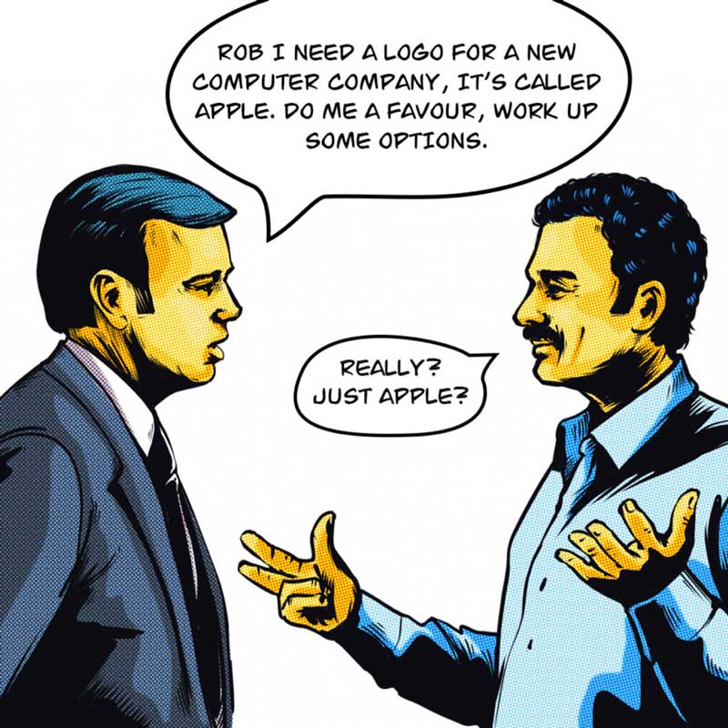
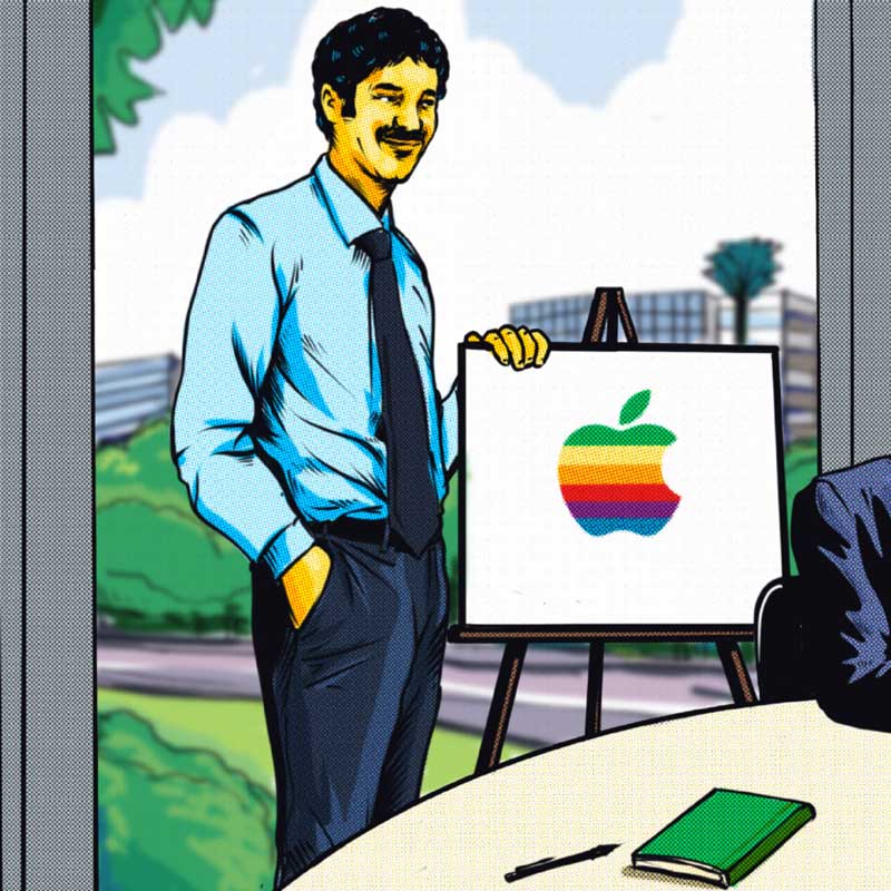
In 1977, twenty-four-year-old art director Rob Janoff, working at Regis McKenna Agency in San Francisco, was asked by the agency boss to create a new logo for a startup company called Apple Computer.
Founded by Steve Jobs in his parents’ garage, Jobs the fruitarian considered the apple a perfect food – “I like apples and love to eat them” he said.
Rob Janoff recalls….
“I seem to remember feeling a smile rising from my gut, or maybe from my head. It always does when an idea starts taking hold”
With something of a hippie-ish reputation, Rob was already working with technology clients, using graphic design to link computing with the everyday and deal with abstract concepts. Although not an IT expert, he was the right person to think creatively about the strange assignment for a computer named after an apple and to tap into the new clients’ way of thinking – “the main idea behind the apple was to bring simplicity to the people in the most sophisticated way and that was it, nothing else” said Steve Jobs in 1981.
Rob’s only brief from Steve Jobs was “don’t make it cute” but Rob knew that he needed to find a way to make the revolutionary idea of personal home computing accessible and attractive. And he had two weeks to achieve it.
His aim was to play with the contradiction between the mechanical and the organic, to make the complexity of the computer feel user-friendly and fun.
“I needed to somehow make it look friendly so that people wouldn’t be afraid to welcome it into their homes”
And to be memorable, to communicate this idea, simplicity was key, making the complex easy to understand.
“I could see right away that I had to look at an apple every which way, every shape, every section, angle, every perspective – and somehow see into the idea of an apple”
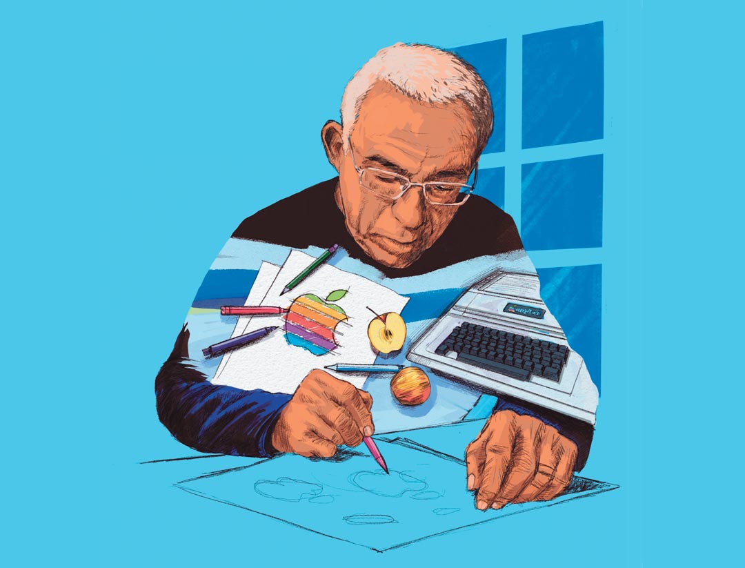
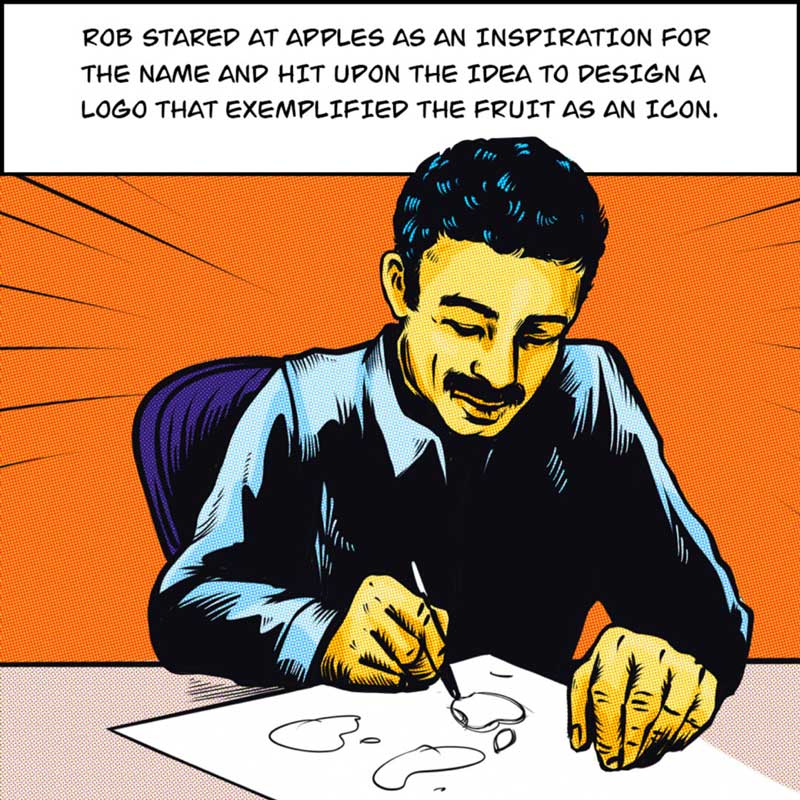
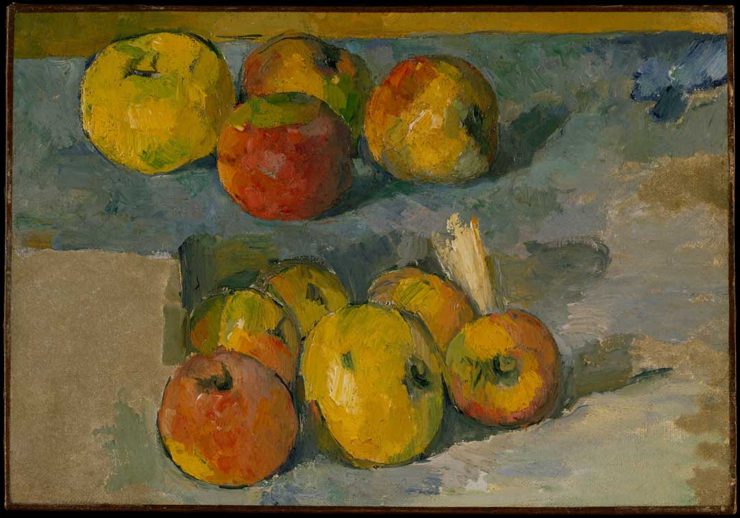
Buying a bag of apples from a local produce store, he laid them on his desk, picked up pencil and paper, and drew and drew apples. Much like Cezanne’s famous apple fascination as he strove to capture the three dimensionality of the fruit in paint.
Rob’s process was about slowly simplifying his studies of apples, whole and cut in half, until he had reached a recognisable outline. The element that made the apple special was the bite which, Rob explains, graphically served two purposes: It indicated the fruit’s scale – this was an apple not a cherry – and it indicated human interaction, biting into the apple for nourishment or metaphorically to acquire all the knowledge that users would get out of the computer. And it also introduced a bit of humour.
Amongst the burgeoning tech start-ups in California’s Silicon Valley, Apple Computer would need to stand out,
“…this new Apple thing had to make a big splash. So it was now up to me…”
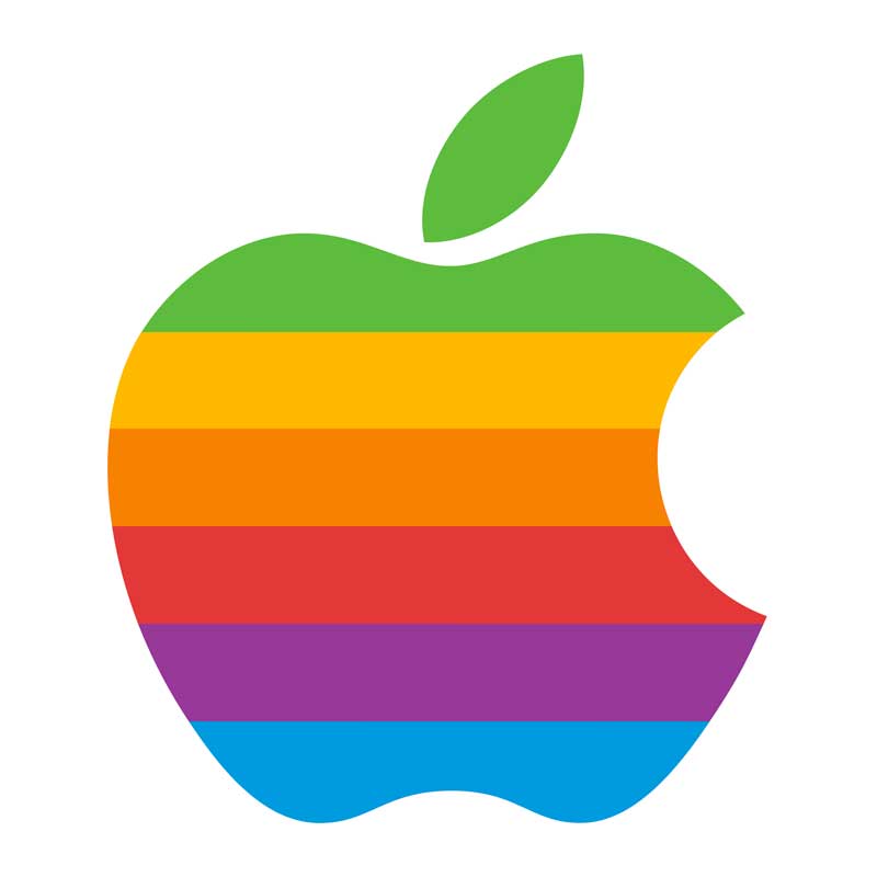
And the colourful stripes, redolent of the six-colour monitors that the Apple II could display on, was the final revolutionary ingredient, bringing pop art to computing and making computers attractive for everyone, including children. The ordering of the colours was simply visual, except the top stripe is green along with the leaf.
Rob showed only the one basic design idea to Steve Jobs, who nodded approval. He had a version without the bite in case Jobs thought the bite was too ‘cute’.
The apple logo, together with the Apple II computer, was launched at the start of the First West Coast Computer Faire in San Francisco on 15th April 1977. The Apple II was revolutionary technology – the invention of the personal computer, complete with keyboard, colour monitor, and built-in programming.
John Sculley (Apple Inc CEO 1983-1993) reports fellow Apple executive Jean-Louis Gassée saying “One of the deep mysteries to me is our logo, the symbol of lust and knowledge, bitten into, all crossed with the colors of the rainbow in the wrong order. You couldn’t dream of a more appropriate logo: lust, knowledge, hope, and anarchy.” The powerful simplicity of Rob Janoff’s logo has allowed it to imbibe all manner of apple stories – from Alan Turing’s cyanide-laced bedside apple and computer bytes to Adam & Eve and Isaac Newton.
Although the shape of the apple was made more symmetrical and geometric in the 1990s, and colours have changed, the basic logo remains the same as designed by Rob Janoff in 1977, when in the space of two weeks he created the apple, the most recognised brand logo in history.
“Even today, it’s almost an out-of-body experience when the Apple logo pops into my field of vision unexpectedly.”
Today Rob Janoff works on branding projects around the world. Together with his Australian business partner Joel Bohm from Australia, Rob helps brand and rebrand top companies, including projects launched globally at the most recent world cup.
Visit www.robjanoff.com for more information about Rob Janoff Studio.
Sources:
- Janoff (2019) Taking A Bite out of The Apple
- Burns (2016) Rob Janoff And The Fascinating True Story Behind His Original Apple Logo Design
- Creative Bits (2020) Interview with Rob Janoff, designer of the Apple logo
- Linzmayer (2004) Apple Confidential 2.0: The Definitive History of the World’s Most Colorful Company
- Sculley (1987) Odyssey: Pepsi to Apple



 Life with more than one Granny - Granny Smith and how her apple made an Australian family
 Imitation Apples Apples have been modelled for centuries – for education, aesthetic, and sharing.