Apple Records’ Granny Smith
A record label inspired by a painting of an apple
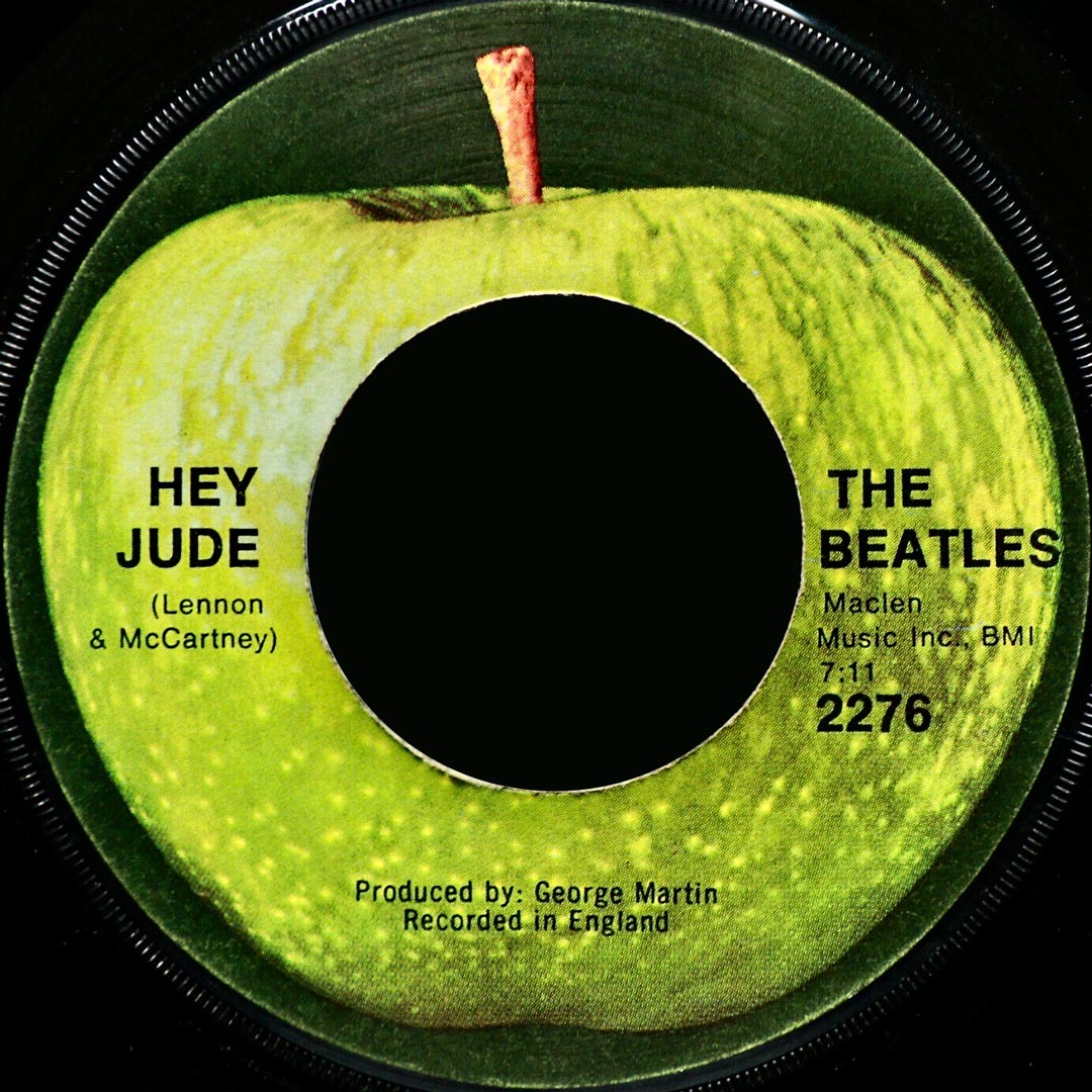
On 26th August 1968 the Beatles’ single ‘Hey Jude’ was released in the USA, the first record on the new Apple Records label, distributed by Capitol Records in North America and by EMI in the UK and the rest of the world. It was one of four records released by Apple Records that day (and four days later in the UK), consisting of ‘Hey Jude’/’Revolution’, Mary Hopkin’s ‘Those Were the Days’ (APPLE 2), Jackie Lomax’s ‘Sour Milk Sea’ (APPLE 3) and the Black Dyke Mills Band with ‘Thingumybob’/’Yellow Submarine’ (APPLE 4).
Douglas Maxwell and Michael Wolff worked on the packaging and marketing for the launch of Apple Records. “The Apple was not our idea – it already existed and there was already some mythology about it” recalls Michael Wolff. Douglas Maxwell, as creative consultant for Apple Records, designed an innovative approach to promoting the new label for the Beatles and Apple’s press officer, Derek Taylor. This included packaging the four singles together into a limited-edition box set, collectively titled ‘Our First Four’. This formed the press package for the launch of the Apple Records label, with a special plastic case delivered by Douglas to the Ritz Hotel in London when Capitol Records executives met the Beatles in advance of the launch. The lettering on the front of the ‘Our First Four’ box set was in graduated colour from green to red, the colours of apples.
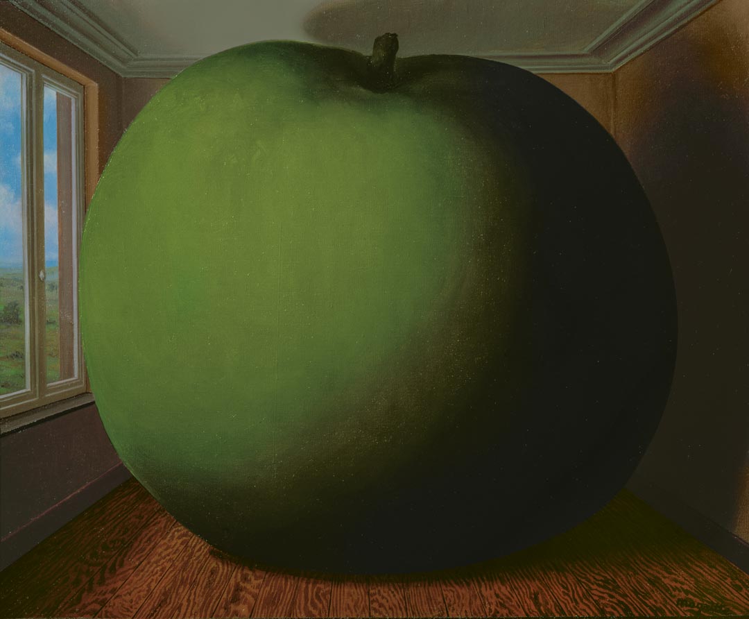
Sir Paul McCartney has explained that the big green apple of the Apple Records logo was inspired by Belgian surrealist painter René Magritte, an artist whose humour and ordinariness had captured his attention. Magritte is quoted as intending to make the most everyday objects shriek aloud, and his levitating and oversized apples do just that.
McCartney’s gallery owner friend Robert Fraser brought him a Magritte painting in 1967.
“We were out in the garden and Robert didn’t want to interrupt, so when we went back in the big door from the garden to the living room, there on the table he’d just propped up this little Magritte. It was of a green apple….Across the painting Magritte had written in that beautiful handwriting of his ‘Au Revoir’. And Robert had split. I thought that was the coolest thing anyone’s ever done with me.”
Sir Paul McCartney in ‘Groovy Bob’
This painting, Magritte’s ‘Le Jeu de Morre’ (1966), became the inspiration for the Apple Records logo.
“That’s where it all came from, this one painting, a big beautifully painted green apple in a frame.”
Sir Paul McCartney in ‘Many Years from Now’
Interpreting this painting, art historian Andrew Graham-Dixon explains “The apple stands for man’s constant awareness of his own mortality. It stands for the knowledge that no matter how high he may rise, a fall of some kind will inevitably ensue. It stands for the fact that things will always change, and no Garden of Eden will ever remain intact.”
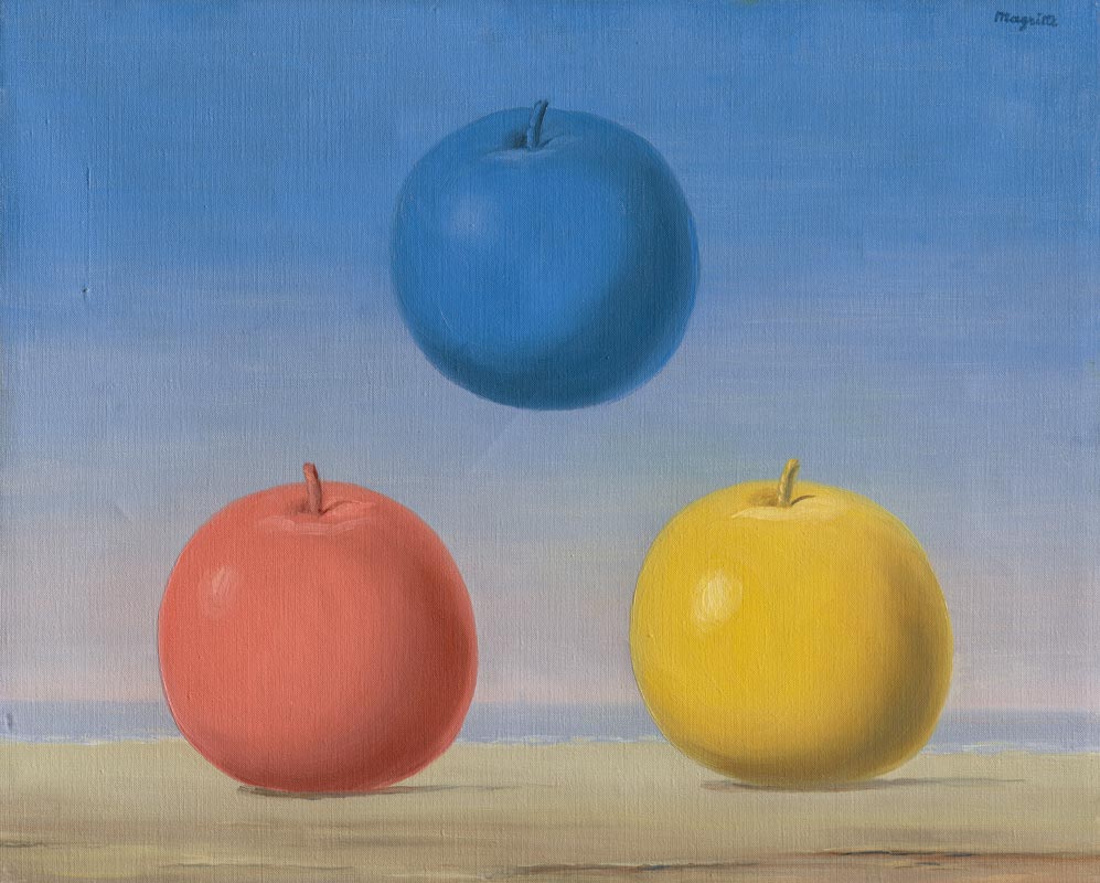
‘Le Jeu de Morre‘ remains in Sir Paul McCartney’s private collection and is not available to share publicly. It is probably a sister painting to Magritte’s painting ‘Les Jeunes Amours‘ and possibly a pun on this title, ‘morra’ being an ancient guessing game.
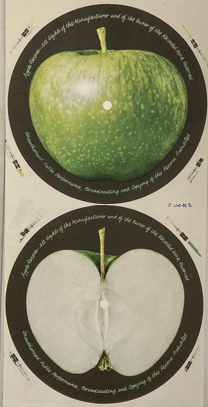
Designer Gene Mahon had worked on the cover of the Beatles’ Sgt Pepper album. In early 1968 Neil Aspinall, managing director of newly founded Apple Corps Limited (itself also a pun) asked Gene for a photograph of an apple for a record label. Gene had the inspired idea of an A side with a whole apple and the B side with an apple sliced in half.
“It was the ultimate Acid-Purist design concept for a record label”
Richard DiLello
Gene commissioned photographer Paul Castell to take a series of photographs of red and green apples, whole and sliced, and against black, red, blue, green, and yellow backgrounds but the process of selecting the perfect apple for the record label took months. It involved all the group and its management at a time when each of the Beatles was starting to go their own way and explore different art forms and cultures.
“It was a shiny green Granny Smith apple on a black background that was finally chosen as the definitive Apple apple. A great moment in the history of the fruit and record industries.”
Richard DiLello
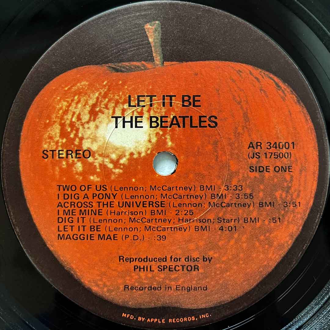
After the original green-skinned Granny Smith apple label, the apple was later released in other colours. A red version of the Granny Smith was used for the label of the 1970 Let It Be album released in the USA, there were also orange, blue, and white versions of the Granny Smith label.
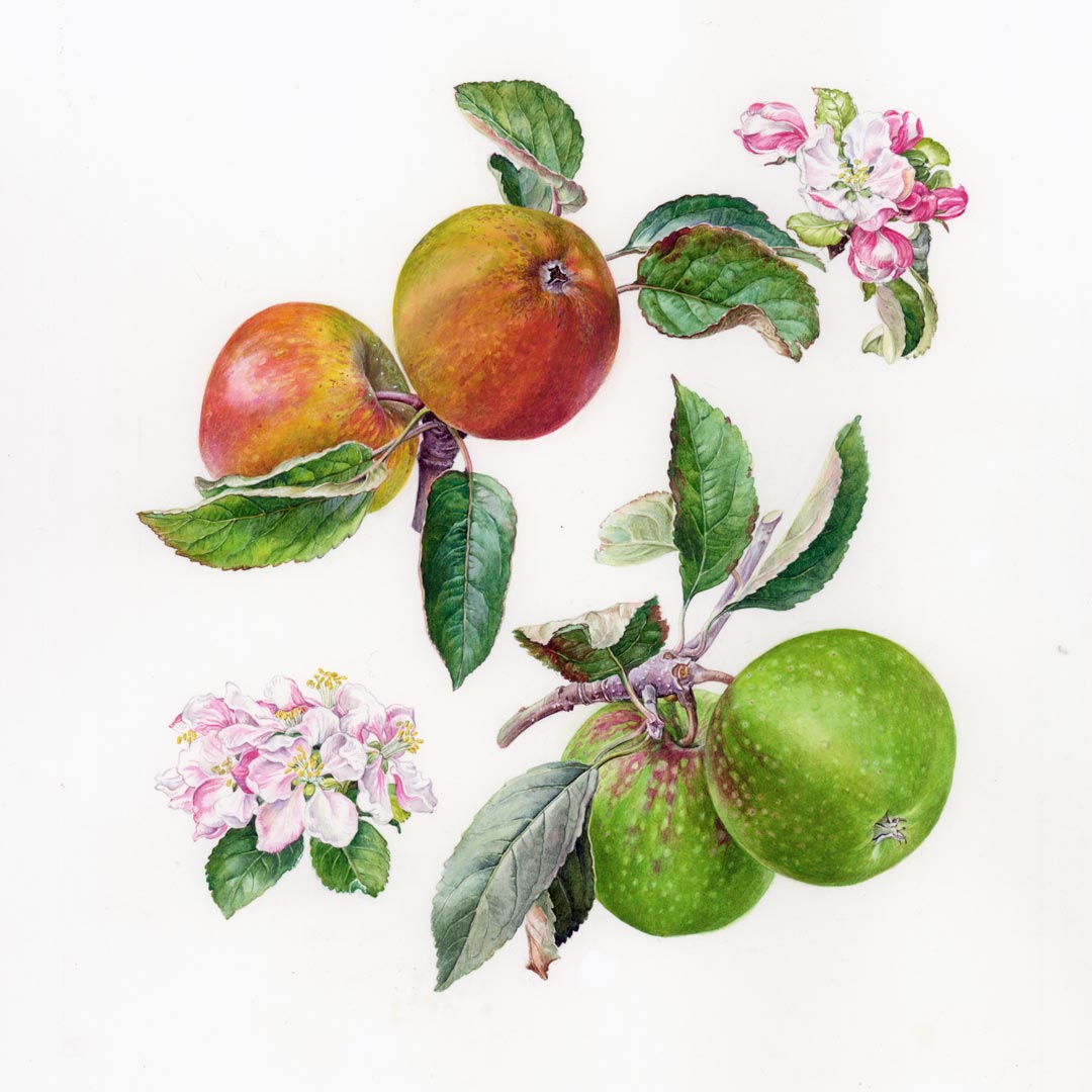
Though, says Michael Wolff, the label could very easily have followed a different artistic route. He talks about contemporary apple artist Rosie Sanders, whose apple watercolours were first published in her ‘The English Apple’ in 1988.
“Had Rosie published her magnificent illustrations of apples twenty years earlier, I might have recommended her to paint the Beatles’ Granny Smith Apple rather than the photograph that was used and that still continues to be used.”
Michael Wolff
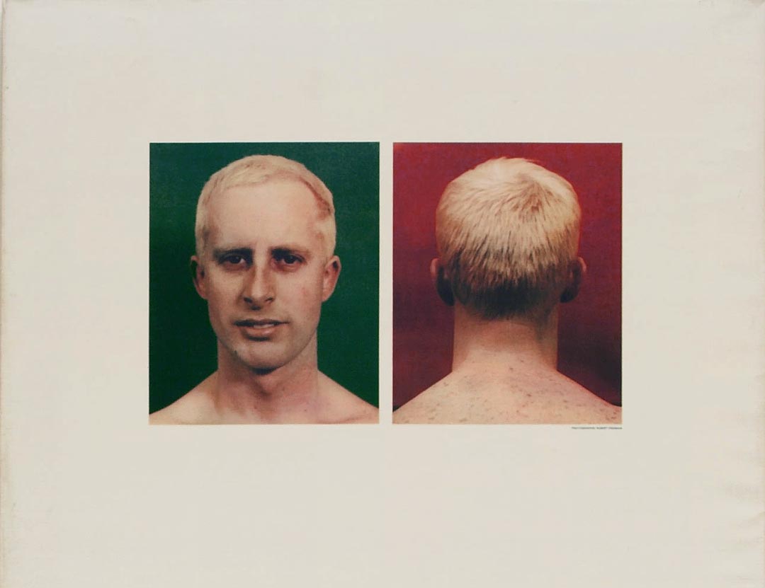
Like Magritte, the New Zealand-born pop and conceptual artist Billy Apple® was also working with apple imagery in the early sixties. He spoke to Apples & People just before his death last year, explaining that he used apples as mnemonic devices to reinforce his rebranding by changing his name. Formerly called Barrie Bates, he launched his new Billy Apple® identity publicly in 1962 at Gallery One, the pioneering contemporary art gallery run by Victor Musgrave. It was the first solo pop art exhibition in London and created quite a stir because the idea of an art brand was new to art. Billy Apple® describes the apple images as “initially just visual aids to support the name change”. This apple art included painted bronze apples and prints, particularly featuring red and green apples, and photographs of the front and back of his head.
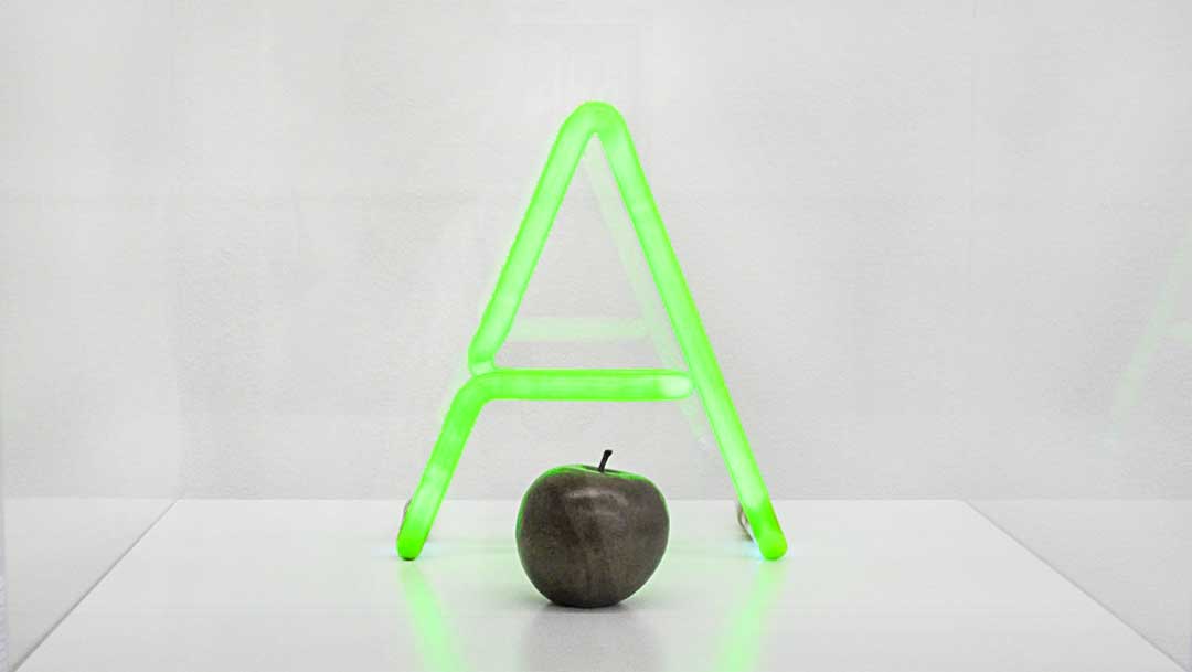
Billy’s first bronze apple sculptures were cast from a real Granny Smith apple in 1962, including the apple in ‘A for Apple’. Later that year in London, he exhibited cast bronze apples that he had painted in red, green, and yellow, which potentially influenced the later different coloured Apple Records’ apple.
“We were there first. McCartney wanted to meet in ‘66 when I was over from New York and I said I didn’t think there was any point, not that interested in his music. Someone really pushed me to go to some club one night, I said no, no. I didn’t want to get into it.”
Billy Apple®
Billy Apple®’s name change with its associated apple art represented the transformation of the artist as a person to a product. Apple Records was also transformative branding. Interpreted by the Beatles, the apple also came to be a symbol of independence and artistic freedom. It brought about a diverse artist-orientated approach to recording.
“It wasn’t partial, it was a massive change of concept and of pace and of style from how record labels were to what the Beatles wanted to make theirs into.”
Peter Asher
Magritte died in 1967, his paintings and philosophy already making cultural impact. His work inspired other musicians too – for example The Listening Room features on the cover of The Jeff Beck Group’s 1969 album Beck-Ola. Of all the surrealist artists, Magritte has probably had the widest influence, not least his image of the apple that inspired a record label featuring a Granny Smith apple.
Sources:
- Asher ‘The Story of Apple Records (2010) (film documentary)’
- DiLello (1972) The Longest Cocktail Party
- Dixon (2000) ‘Le Jeu de Morre by Rene Magritte, 1966; the Apple Corp. logo, 1967’
- Jacques and McCartney (2015) Paintings on the Wall – René Magritte
- Miles (1997) ‘Paul McCartney Many Years from Now’
- Sanders (1988) ‘The English Apple’
- Vyner (1999) ‘Groovy Bob: The Life and Times of Robert Fraser’
Thanks to:
- Billy Apple® and Mary Apple. Billy Apple® is represented by The Mayor Gallery, London
- Peter Asher, Apple Records A&M
- Douglas Maxwell and Susan Maxwell. Douglas worked for the Beatles and Apple Records, and later for Sir Paul Mc Cartney’s Wings. Both Susan and Douglas were in the cramped studio for the final mix of Hey Jude.
- Tony Rasmussen, Sydney, Australia – beatlesblogger.com
- Michael Wolff RDI, co-founder of Wolff Olins



 Peter Paul Rubens and Jan Brueghel the Elder - The Garden of Eden with the Fall of Man c.1615, oil on panel, Mauritshuis, The Hague
 Bringing The Apple Home